
ROCKDALE, Texas — The City of Rockdale and the Rockdale Municipal Development District are adopting a new logo.
Rockdale City Council adopted the logo Monday at a council meeting, consulting with a group of residents before choosing the design.
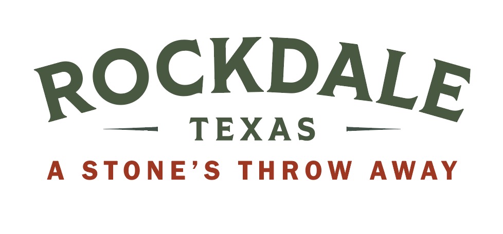
The design change the city's colors from blue to orange and green and replaces the old Texas shape with a linear layout.
"Green is meant to reflect rebirth renewal and the orange... that's meant to represent energy and vibrancy," said Economic Development Director of the District, Jim Gibson.
Its new logo and tagline, "A stone's throw away," will reflect the ongoing developments in the area like the 1895 project, Sandow Lakes Ranch plan and Cornerstone subdivision, being brought in from other companies and organizations.
"It's meant to highlight the fact that Rockdale is near many different things," Gibson said.
"We're near big city markets. We're near workforce. We're near education institutions. We're near jobs."
He says the re-brand will be used to market, attracting more growth.
"We also realize that the city has to present an image because we need to be able to attract talent to look at Rockdale, and to purchase the houses and continue to grow the economy," Gibson said.
The city is still in the process of updating all its products with the new branding.